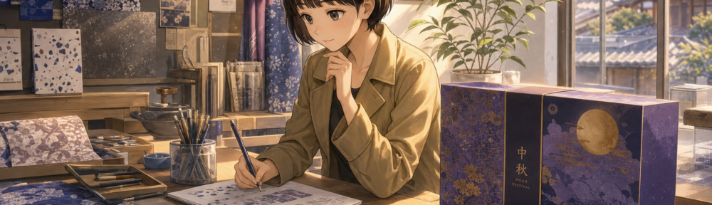
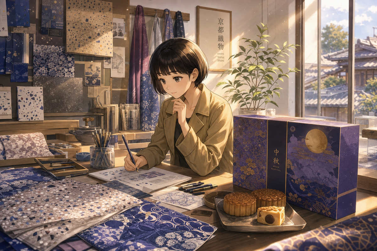
咖啡館後巷那種老公寓的地板,灰底裡摻著碎石粒、走上去有點涼——小時候在阿嬤家踩過的人不少,長大後只在拆遷前的老屋才會多看一眼。這種磨石子地板,2026年中秋被一個京都印花品牌印上了禮盒。
京都設計品牌SOU・SOU與台灣一家入選世界百大的咖啡館合作,推出中秋聯名禮盒,把台灣老建築常見的磨石子紋路,和SOU・SOU自己那套經典的日系印花圖騰放在一起。這件事的重點不在禮盒好不好看,而在誰決定了設計語言的方向。過去這類合作的劇本通常是台灣品牌去買日本IP的授權,套上日本的角色或紋樣,賣給台灣消費者一種「來自日本」的溢價感。這次順序反過來——日本品牌主動把台灣的視覺元素,拿進自己的設計系統裡使用。
誰在消費誰
台灣長年被放在「文化消費者」的位置上:買日本的清潔用品聯名、買日本的插畫角色周邊、去日本品牌的快閃店打卡。今年稍早,台灣老字號清潔品牌毛寶就和SOU・SOU推出過聯名包裝,用的仍是SOU・SOU自己的招牌紋樣「十數」。這是典型的第一種劇本——本土老品牌借日本美學翻新形象。
磨石子聯名不一樣的地方在於,被拿去用的圖案語言是台灣的。它沒有被翻譯成「有點日本味的台灣元素」,而是被原樣挪進了SOU・SOU的印花邏輯裡,和品牌自己的圖騰並列出現在同一個包裝上。台灣的手搖飲品牌萬波今年8月也和日本插畫品牌OSAMU GOODS做了聯名,主題是「美好舊時光」——那仍是台灣品牌去引用日本的懷舊符號。磨石子這次,是懷舊符號本身換了輸出方向。
台日交叉的密度
把這件事放進今年以來一連串的台日聯名裡看,會發現密度高到不像單一事件。日本潮流選物店FREAK’S STORE找了台北赤峰街的獨立咖啡店COFFEE DUMBO合作;英國品牌DAKS攜手日本設計師品牌Scye,選擇在台灣辦快閃店,而不是先去日本;日本紙品品牌手紙社把策展搬進台北華山文創園區的舊酒廠建築。這些案例疊在一起,說的不是「台灣很紅」這種空泛結論,而是一個具體變化——國際品牌開始把台灣當成亞洲布局裡可以主動策展、主動聯名的一站,不是被動銷售的市場。
這背後牽涉的因素不會只有一個。台灣的精品咖啡場景本身在國際排名裡已有位置,本土老建築的美學符號經過多年的文創包裝也被重新讀出價值,加上市場規模適合快閃、聯名這類低成本高討論度的合作形式——這些條件疊在一起,才讓磨石子這種在地元素有機會被別人拿去用,而不是單一某個原因。
一個花紋能被記多久
磨石子地板本身正在從台灣的老建築裡慢慢消失,拆除、翻新、換成磁磚或水泥自流平。它變成禮盒上的印花,某種程度上是它在真實空間裡越來越少之後,才被允許進入設計語言的循環。這個順序值得留意:本土元素往往先被同一代人嫌老氣、拆光,再被外部的眼光重新標記為「美學」。
禮盒會在中秋節後過季,包裝紙會被收進櫃子或直接回收。磨石子地板不會因為一個聯名禮盒而被保留下來。但2026年這一次,至少紀錄了一件事:那個圖案語言,先被日本品牌看懂了,再被印上了自己的包裝。
— 陳映彤
A Japanese Brand Borrowed Taiwan’s Terrazzo Pattern
Old apartment floors in Taiwan have a certain texture: grey concrete flecked with stone chips, cool underfoot, the kind of surface a lot of kids grew up walking on at their grandmother’s house and later only get noticed right before a building gets torn down. That terrazzo pattern is now printed on a Mid-Autumn Festival gift box, released in 2026 by a Kyoto textile brand.
Terrazzo flooring, a staple of older Taiwanese buildings, has been paired with the signature print motifs of Kyoto design brand SOU・SOU in a joint gift box with a Taiwanese café ranked among the world’s best. The interesting part isn’t whether the box looks good. It’s who decided the direction of the visual language. The usual script has Taiwanese brands licensing Japanese IP, stamping a Japanese character or pattern onto a local product, and selling it back to Taiwanese consumers as imported prestige. This time the order flipped — a Japanese brand reached for a Taiwanese visual element and folded it into its own design system.
Who’s Consuming Whom
Taiwan has long sat in the position of cultural consumer: buying Japanese-branded cleaning products, Japanese illustrated character merchandise, lining up at Japanese pop-ups. Earlier this year, long-running Taiwanese cleaning brand Maobao partnered with SOU・SOU on packaging that used the brand’s own signature “十數” pattern — a straightforward case of a local legacy brand borrowing Japanese aesthetics to refresh its image.
The terrazzo collaboration works differently. What got borrowed is Taiwanese. It wasn’t translated into “a Taiwanese element with a Japanese accent” — it was lifted directly into SOU・SOU’s own print logic, sitting alongside the brand’s existing motifs on the same box. Taiwanese bubble tea chain Wanpo Island Tea ran its own tie-up with Japanese illustration brand OSAMU GOODS this past August, themed around nostalgia — but that, too, was a Taiwanese brand citing a Japanese nostalgia symbol. With the terrazzo box, the nostalgia symbol itself switched export direction.
A Pattern, Not an Incident
Set against a run of other Taiwan-Japan collaborations this year, this stops looking like an isolated event. Japanese select shop FREAK’S STORE teamed up with independent café COFFEE DUMBO on Taipei’s Chifeng Street. British heritage brand DAKS, working with Japanese label Scye, chose to debut a pop-up store in Taiwan rather than Japan first. Japanese stationery brand Tegamisha brought a curated exhibition into an old winery building at Taipei’s Huashan Creative Park. Stacked together, these cases point to something more specific than “Taiwan is trendy” — international brands are starting to treat Taiwan as a site where they curate and co-create, not just a market to sell into.
No single reason explains it. Taiwan’s specialty coffee scene already has standing in global rankings, decades of creative-industry reappraisal have given old architectural motifs new aesthetic currency, and the market’s scale suits low-cost, high-buzz formats like pop-ups and collaborations. It’s a combination of factors, not a claim about who “gets it” best.
How Long a Pattern Gets Remembered
Terrazzo flooring itself is disappearing from Taiwan’s older buildings — torn out, renovated over, replaced with tile or self-leveling cement. That it now shows up as a print on a gift box says something about sequence: local elements often get discarded as dated by the generation that grew up with them, then get relabeled as “aesthetic” once an outside eye notices them.
The gift box will go out of season after the festival. The wrapping paper gets recycled or shoved in a drawer. No terrazzo floor gets saved because of it. But in 2026, this particular exchange got recorded on the record: the pattern got understood by a Japanese brand first, then printed on that brand’s own box.
— 陳映彤
延伸閱讀
https://justfly.idv.tw/s/o7WphPW